Friday, November 21, 2008

Tuesday, October 21, 2008

Stefanie Posavec “On the Map”


I can't remember how I stumbled upon Stefanie's work, but I find it truly inspiring. She visualizes words and literature in a visual way, based on rules that she associates with a given text. The result, a visual fingerprint of the pace/tone/colour of a piece of writing. Brilliant! :)

http://www.notcot.com/archives/2008/04/stefanie_posave.php

Sunday, October 19, 2008

Ambigram: Symmetrical Text Design


Hello Guys~

Here is something I came across while reading Dan Brown's old novel Demon & Angel, the ambigram. In the Dan Brown's offiical website gives a little bit of introduction of what it is,
and here is the link.

According to Wiki's definition, Ambigram is "sometimes known as an inversion or flipscript, is a graphical figure that spells out a word not only in its form as presented, but also in another direction or orientation. The text can also consist of a few words, and the text spelled out in the other direction or orientation is often the same, but can also be a different text. Douglas R. Hofstadter describes an ambigram as a "calligraphic design that manages to squeeze two different readings into the selfsame set of curves." The term "ambigram" was first used to mean "ambiguous anagram" by Judith E. Bagai, a former editor of The Enigma, the official organ of The National Puzzlers' League."

Saturday, October 4, 2008

Crazy Clock

When I was researching for the crazy clock assignment I came across this interesting clock design by Hong Kong designer Alan Chan:


The Magic of Chinese Calligraphy


Photo Photo Photo
enlarge Click to Enlarge Images

Combining East and West has always been Alan Chan's style, and this circular clock designed for Seiko of Japan is no exception. "The clock may be a Western invention, but there is always room to add Chinese elements for an alternative feeling," says Chan. For one thing, the basic black-and-white colour scheme immediately conjures up yin and yang. The usual Roman or Arabic numerals have given way to Chinese characters. But interestingly, each numeral is not complete until the black minute hand lands on it to provide the missing stroke. The minute hand itself is inspired by the "eight fundamental strokes of yong", a form of Chinese calligraphy. Add to it the red ink seal marks at the clock's outer edge and the clock becomes a virtual scroll of calligraphic variations. This witty design deftly melds contemporary sensibilities and chinoiserie, and it is no surprise that it continues to reap award after award all over the world.

As a native Hong Konger, Chan confesses that combining East and West is like second nature to him. Whether the design is for something as small as a packet of tea, or as far-reaching as the entire corporate image of a brand, Chan's first consideration is always how it might mobilize the market, before he starts to think about its form or use of colour. "There's always something to learn from, whichever Chinese dynasty you turn to," he asserts. "Five thousand years of culture and wisdom are unimaginably profound."


photo

Flash movie of how the clock works:
http://www.alanchandesign.com/acd/main.html
Click on Product Design > Seiko Clock

Friday, October 3, 2008

Web and typography

As a web designer, one of my pet peeves, is the ignorance of typography in web design. Yes, in the past the challenges of having the art of typography displayed may have been a hindrance in Web Design and Typography, but this day and age, there are so many ways around it.

I realize that there are many issues with displaying certain elements in certain browsers and platforms, but everyone should be browsing on Firefox anyway ;-)

Here is an article with extracts of "The Elements of Typography Style" from the website Web Typography

" Introduction

For too long typographic style and its accompanying attention to detail have been overlooked by website designers, particularly in body copy. In years gone by this could have been put down to the technology, but now the web has caught up. The advent of much improved browsers, text rendering and high resolution screens, combine to negate technology as an excuse.

Robert Bringhurst’s book The Elements of Typographic Style is on many a designer’s bookshelf and is considered to be a classic in the field. Indeed the renowned typographer Hermann Zapf proclaims the book to be "a must for everybody in the graphic arts, and especially for our new friends entering the field."

In order to allay some of the myths surrounding typography on the web, I have structured this website to step through Bringhurst’s working principles, explaining how to accomplish each using techniques available in HTML and CSS. The future is considered with coverage of CSS3, and practicality is ever present with workarounds, alternatives and compromises for less able browsers.

At the time of writing, this is a work in progress. I am adding to the site in the order presented in Bringhurst’s book, one principle at a time. You can subscribe to an RSS feed for notification of new additions.

I am excluding those principles which are not relevant to the Web or that do not require a technical explanation. Unfortunately this excludes the entire opening chapter, the Grand Design, which I heartily recommend you read as it lays down the foundations, philosophy and approach to good typography in any medium. If you were to take any working principle from the Grand Design, it would be this: "Give full typographical attention even to incidental details."

Now start with Rhythm & Proportion or dip into the Table of Contents and enjoy pushing a few boundaries to create websites of real typographical worth.

— Richard Rutter, Brighton, 2005.
"

Local Type "stuff" store

I have always been interested in finding actual pieces of lead type and looking at all the cool stuff out there for (possible) purchasing in the future. Once I have some extra cash, my goal is to start collecting this stuff.

Here is a Canadian supplier of cool typography 'stuff'

http://www.donblack.ca/default.asp

LetterCult Site

Here is a really great new site which includes interviews and a bunch of other great information.

http://www.lettercult.com/

Thursday, October 2, 2008

Incomplete Manifesto

Came across this while surfing about the net. Interesting to see what someone else has done.

Sunday, September 28, 2008

FREE 
FONT
MANIFESTO
By
Ellen Lupton


A small but growing number of designers and institutions are creating typefaces for the public domain. These designers are participating in the broader open source and copyleft movements, which seek to stimulate worldwide creativity via a collective information commons.

Ellen Lupton's web page provides information and airs ideas about the concept of free fonts. Its annotated appearance reflects her conversations with type designers about the danger and necessity of free fonts. 


Friday, September 26, 2008

Dalton Maag Posters

check the sequence

Thursday, September 25, 2008

Fun with Ampersands


There is a beauty - sometimes very strange and unique - to ampersands.


Top line from left: Nilland, Bitstream Vera Sans, BPmono, Kontrapunkt, Diavlo
Bottom line from left: La Peruta FLF, Skia, Tuffy, Lacuna, Fontin

Wednesday, September 24, 2008

Cheap Vinyl letters

I found this sign 
on East Van
This could be a new typeface called: Cheap Vinyl Letters or Old Vinyl Letters.

Sunday, September 21, 2008

How to post from video site.

How to post from video site.
To post a video - grab the embed code (under the users info box on YouTube).
Paste code into the Html Code pane in the blogger 'New Post" code box and change the with width and height to 340 and 275 both at the beginning and end of the code string.
Done.

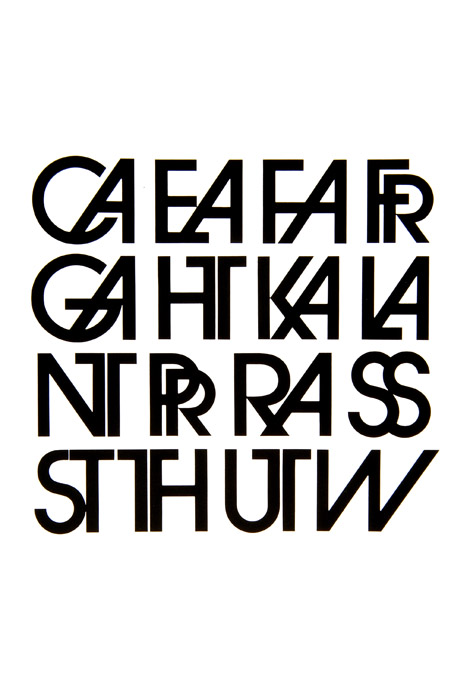
Avant Garde Ligatures


Friday, September 19, 2008

Pioneers of Modern Design by Herbert Spencer

DADA Typographic Compositions

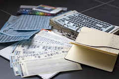
Pre-desktop-publishing nostalgia


Pre-desktop-publishing nostalgia
Originally uploaded by Veerle Pieters

Control letraset


Control letraset
Originally uploaded by walterh

Neville (Eric)


Neville Brody 
Originally uploaded by qu1j0t3

Wim Crouwel


Wim Crouwel
Originally uploaded by Xavier Encinas

Vienna Subway's Display Letters


Vienna Subway's Display Letters
Originally uploaded by Adam Sporka

closeup


closeup
Originally uploaded by vikosh

5 DM


5 DM
Originally uploaded by fotofrog

Montesori Materials 15


Montesori Materials 15
Originally uploaded by Shaun.numb

MILSPEC STENCIL


eyetwist_signs_165.jpg
Originally uploaded by eyetwist

Lois


Lois
Originally uploaded by Xavi Calvo

Stockholm public library, Sodermalm


Stockholm public library, Sodermalm
Originally uploaded by Fredrik73


Sticker: The Designer's Republic

Daler Spiral Bound A5: SPA Two


Daler Spiral Bound A5: SPA Two
Originally uploaded by ekusupo

Drawing of 3D type

mmm magazine

music music music gets it debut online...
magculture.com:
Here

Bush Sleeve by Michael Hernan


Bush Sleeve by Michael Hernan
Originally uploaded by ekusupo

Investigating ambiguity of letterforms.